
Ensuring all users can engage with your website content in a meaningful way is essential in today’s digital landscape.
Small decisions in how your website is designed can have a significant impact on how easily users are able to understand and interact with your content. When accessibility is prioritized, websites become more effective for everyone.
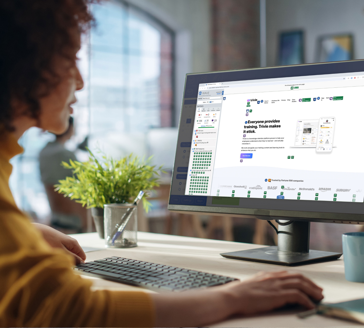
You can begin by checking the current state of your website’s compliance by using WAVE’s Web Accessibility Tool. Just type in your website address at wave.webaim.org, and this tool will begin to compile a report with any issues you might have.
Many of the most impactful improvements are simple to implement.
Below are practical steps you can take to improve accessibility on your website and create a more seamless experience for all users.
1. Keep color contrast top-of-mind.
For visually-impaired users—including those who are color blind (1 in 12 men, and1 in 200 women, or about 4.5% of the entire population)—ensuring appropriate color contrast is the number one thing you can do to ensure legibility and compliance.
People with low-vision will have a tough time distinguishing between elements of various colors, including reading the text, if the color contrast is too low.
Use WebAIM’s Contrast Checker to ensure the color of your foreground elements has enough contrast against the background elements.
A good goal to aim for is WCAG 2 level AA.
WCAG 2 level AA requires a contrast ratio of at least 4.5:1 for normal text and 3:1 for large text, and a contrast ratio of at least 3:1 for graphics and user interface components (such as form input borders).
Large text is defined as 14 point (typically 18.66px) and bold or larger, or 18 point(typically 24px) or larger.

2. Use real text: Don’t use image-based text, even within PDFs.
While you or your graphic designer may sometimes want to use those fancy fonts that aren’t supported on the web, resist the urge to make them into an image and put them on your website or within email marketing messages. Although this allows for high levels of visual customization, using real, coded text on your website has a number of benefits when it comes to accessibility (and SEO).
Assistive technologies such as screen readers cannot “see” text that is within images or PDFs (neither can Google). Screen readers can only access the underlying code of your website, not the text in an image.
Users utilizing screen readers will not be able to access any text that is within an image. Plus, screen enlargers and zoom settings often yield blurry, unreadable images.
In some circumstances, PDFs may be necessary for large volumes of information, but try to minimize their use. When needed, you can create a tagged PDF, which provides accessibility within the PDF.
Alternatively, you could provide a statement adjacent to the PDF stating to contact you if a text-based version is necessary. Think of this in the same way you might handle an accommodation request at your physical location.
Real text rather than image-based text or PDF files will also load quickly over poor internet connections, so users without access to fast internet connections will be able to use your website more efficiently as well.
Always avoid using image-based text in any digital marketing application, whether that’s your on website, in email marketing, or social media marketing.
3. Create a consistent, organized layout.
Though important for users of all abilities, for both assistive technologies and users with disabilities such as dyslexia, the layout of your website and the hierarchy of information are especially important to usability. Delineate menus, links, and buttons from one another to make them easily navigable throughout the entire site.
Establishing hierarchy though layout, text size, and color is important for users of allabilities. Your website should be easily scanned and read.
For users with both cognitive and situational disabilities (such as being in a hurry or being distracted), reading and understanding long blocks of text isn’t easy. Hierarchy helps users quickly read and understand the content on a website.
4. Consider the size, line spacing, and justification of text.
Size
Use a minimum font size of 14px. Always ensure your text is large enough for people to easily read regardless of the device they are using to navigate your website.
Line Spacing
Finding the balance between enough space between lines of text, but not too much, is an important design consideration.
“Many people with cognitive disabilities have trouble tracking lines of text when a block of text is single-spaced. Providing spacing between 1.5 to 2 allows them to start a new line more easily once they have finished the previous one.”
Source: W3G
Justification
Design considerations such as using left-justified text for large sections of copy can also aid in usability.
Readers rely on visual cues to make sense of where they are on a page or screen. One of the most important cues is the start of a new line, which acts as an anchor for the eye as we’re reading or skimming content.
With left-justified text, that anchor lives at the left edge of the content block. Left-justification is one of the best ways to keep long blocks of copy readable.
Refrain from using fully justified text as that produces large gaps of whitespace that create hurdles for people with cognitive disabilities.
5. Make sure all links and buttons are usable.
When it comes to interacting with your website, ensure your users can use all links and buttons. Make text links distinguishable from surrounding text with underlines. Solely relying on color or bold weights for link styling makes it very difficult for colorblind users to see them.
Ensure all buttons or clickable elements are large enough for all users, including those that may not have a steady hand, or who may be using a pointing device.
Include ample space around click targets to reduce accidental link taps and avoid user frustration.

By intentionally designing with accessibility in mind, you create a website that works for everyone.
This blog is part of our Website Accessibility Guide, a series exploring how businesses can build more inclusive websites.
In this guide, you’ll learn:
- Why website accessibility matters and the impact it has on your bottom line
- How to design and build inclusive websites to provide a better experience for all of your customers
- How to implement simple changes to create websites that can be accessed by people of all abilities, and ensure usability for assistive technologies
Click here to download the complete guide as a PDF. You can also continue following along as we publish additional articles from the guide here on our blog.
Let’s create a more inclusive internet together!